


If designer Ana Donohue was ever told not to color outside the lines, she ignored the advice. The Boston-based designer is principal and founder of Ana Donohue Interiors, a “Best of Houzz” favorite, an HGTV regular, and is beloved for her deft handling of rainbow hues—so much so that clients flock to her for it. “I’m known for unusual pairings of colors, patterns, textures, and different styles in a room,” she says. “My work is pretty consistent—usually color, but with a neutral ground.” Donohue’s clients run the gamut: she gets many Europeans who are looking for something edgy and sophisticated, as well as American empty nesters and families that are just starting out.
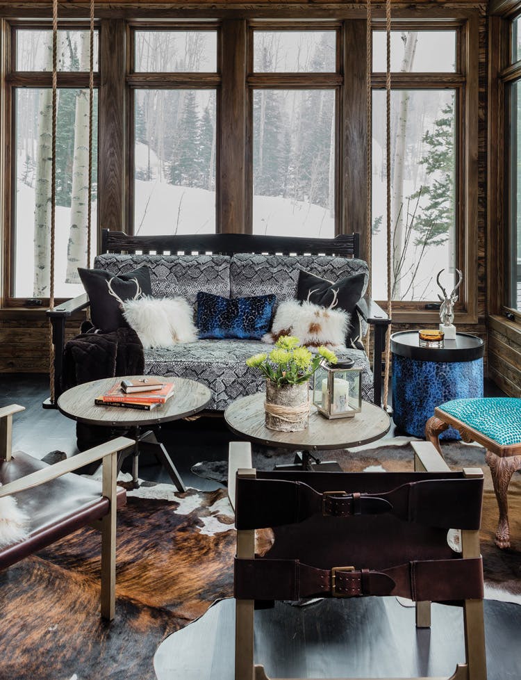
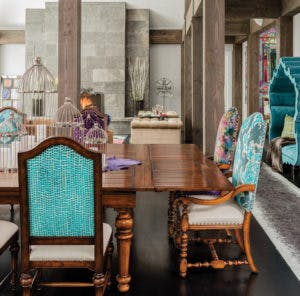
Take this sweeping 6,000-square-foot Park City, Utah vacation home, which is anything but typical western mountain style. Colors in ice cream sprinkle–worthy tones run the spectrum throughout the property, from the floral Anthropologie rug in the living room to the turquoise wall color (Sherwin-Williams’ Freshwater) in the powder room. “These clients are the nicest people on the planet,” says Donohue of the homeowner couple. “She is very vibrant—she loves color and she loves pattern and all the energy it gives. She couldn’t really find a designer that could do that out in Utah, where they specialize in earth tones.”
So how did Donohue paint a Crayola-bright world in an outdoorsy mecca without it becoming garish or gaudy or Liberace incarnate? She just went for it. “I think you can’t be afraid of color,” she says. “You have to dive in and then edit yourself a bit.” Part of that editing is preventative. Donohue w
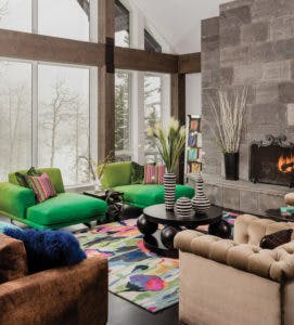
as careful to keep a fine balance (using natural materials, such as stone and reclaimed oak finishes) and not allow any one thing to become too loud. “If you’re working with really strong colors, even a little bit really pops—like the pink and turquoise on the stools in the kitchen. I often play with the scale of what the patterns are on the fabric and the textures and how they’re going to have a rhythm throughout the room. If you have a really saturated color, you want it to balance evenly and
cohesively—even if it’s the smallest piece of matting on a piece of art.” For Donohue, there is no such thing as a little thing when it comes to decorating. “It’s the tiny details you don’t think about when you’re in the room. But it all feels comfortable when you’re in there because it makes sense. It feels right.”
The designer keeps her selections timeless, too, so they don’t end up looking passé in a matter of years. That’s key to creating any home, even a vacation home like this one—it should be a place that you always long to return to, again and again, whether after the end of a stressful workday or for a few months’ vacation. “I try not to use trends too much and stick with classic chevron patterns or classic looks like plaid, especially if I’m using a bolder color,” says Donohue. “When you get into arabesque or other patterns, they can read a little trendier. So, if I’m using that, I pick a slightly more subtle color.”
 One of the most notable rooms in the house for Donohue? The entry, where antiqued mirrors and flowery Osborne & Little wall coverings conceal the utilitarian doors. Any foyer, from one in a tiny apartment to a large estate, she says, must make an impact; it should announce exactly what type of home you’re entering right off the bat. “Entries are so very important,” she says. “I might wallpaper the ceiling and have amazing sconces and a really cool piece of art on the wall. Something that tells the type of person that lives there.” Because it’s vital for a home to feel at one with the homeowners, Donohue infused their personalities throughout the space. She kept some furnishings from their previous homes that remind them of happy memories. On the threshold of each guest bedroom is the name of a city that the homeowners lived in at some point. “That was one of my favorite details,” she says. Another: the media room. “With its green, faux-crocodile wallpaper, it’s really cozy in there.”
Donohue adored working with these clients—a feeling that always results in a better outcome. “This collaboration was so great,” says Donohue. “[The homeowners] let us have free reign to bring in extra accessories and things like that. Sometimes I’ll say, ‘I need 15 percent of freedom at the end to finish the space without having to approve every item.’ If you give your designer trust, the result is usually going to end up really nice.”