


GOING BIG IN A SMALL SPACE
A steady influx of tech money and limited land have rendered San Francisco, California, a de facto real estate nightmare—unless, that is, you’re willing to painstakingly build the dream. So it was for this Jackson Square neighborhood abode, an 850-square-foot, two-story retreat in a Gold Rush-era bourbon and Levi’s warehouse that the owners envisioned as an executive suite. The trouble was, when designer Deniece Duscheone kickstarted this six-week renovation, there was little (ahem) suite about the place. “It was really bad 1980s architecture,” she recalls. “The floors were teak but stained red, the cabinets were tigerwood, and counters black marble, and there was a black-steel fireplace in open-bracing in the living room. It felt super enclosed and very, very tiny!”
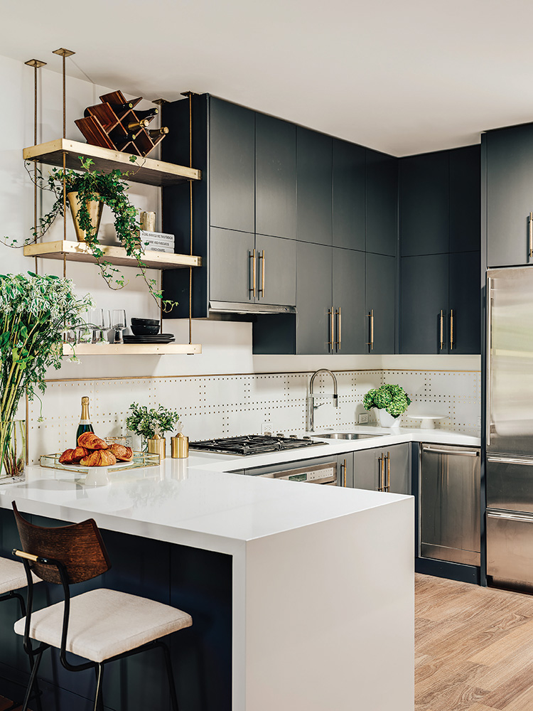
Duscheone’s solution was to approach it as an exercise in New York City small-space living, starting with one of the biggest eyesores—the kitchen. First, she ripped out some of the cabinets, which she felt were too oversized for the space. In their place? “Open shelving, custom designed by me, in solid walnut with a brass outer shell and metal stanchions,” she says. “That way, it didn’t feel like the cabinets were coming into the living room.” She lowered the bar-height counter to a normal level to allow for a more open feeling, and installed a waterfall edge that turned it into more of a work of art than a functional necessity. “Visually, it pulls it back, so the walkway feels bigger,” says Duscheone. Refinished cabinets, new handles, and an Artistic Tile backsplash gave it a fresh sensibility that reads as unequivocally now. “If you saw the ‘before,’ you would die,” says the designer.
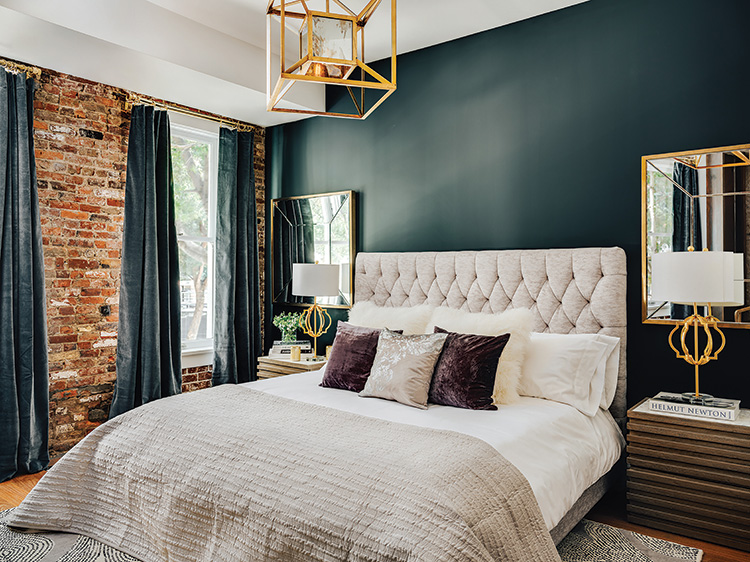
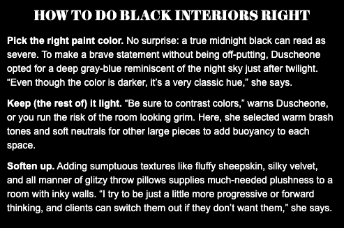
Perhaps her boldest move came in the form of what appears to be jet-black walls and cabinets, which are actually a deep, dark, grayish blue, per the designer. “Because it’s a small space, the first thing that somebody thinks is, ‘We have to make everything really light,’” says Duscheone. “But no, we have to contrast what we’re doing—like against these lighter cabinets in the kitchen.” Brass hardware plays off the gold tones in the adjacent brick, while powder-coating the white metal of the fireplace unites it with the new kitchen counters. “Now there’s a common thread between the two spaces, which is super important, especially in a small space,” she says. In the master bedroom, a tufted vanilla headboard and a pair of gilt mirrors placed symmetrically on either side of the bed soften the moody hue— creating a restful reprieve from the city.
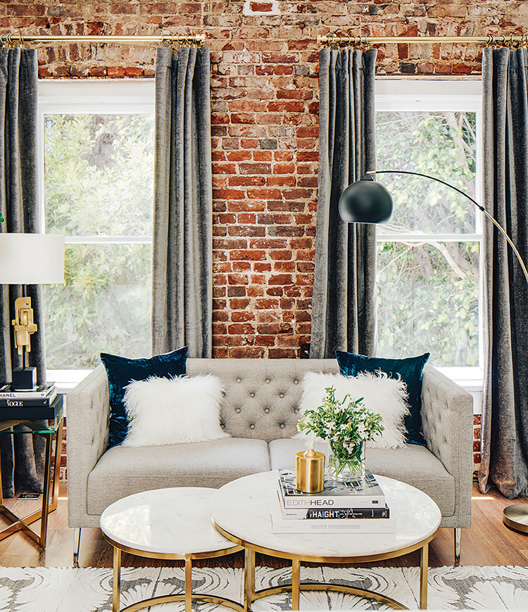
Duscheone maximized the flow of the intimate living room by opting for smaller scale furniture, such as a tufted studio sofa and a steel-and-leather belted chair, which adds a note of masculinity that jibes with the architecture. “I have a background in designing hotels, and part of what I do when I design is create room for people to have conversations,” says the designer. And in this small city home, there is a lot to talk about.
The home’s most distinctive showpiece is arguably the brick walls, still intact from their nineteenth-century heyday. “It’s truly from the time period,” says Duscheone, adding that she softened them visually by hanging plush-velvet curtains in the living space. “We had [the walls] washed and cleaned, then had the adjacent steel repolished.” The vermillion floors posed another challenge. “We thought we were going to have to pull it out to get all that red out,” recalls the designer. “And my clients thought ‘Oh, should we just get new floors later?’ I knew we had to get it done now. If we didn’t, it would be like a black eye in the room.” Her refinisher ended up being able to strip the floors without damaging them, and then used an oil rub to give the finish a time-worn, industrial vibe. “I didn’t want any sealer on it; I wanted it to be natural and sophisticated.”