


A North Carolina Living Room Completed with a Plan
WRITTEN BY BLAKE MILLER PHOTOGRAPHY BY LAURA SUMRAK
When Lacey and Patrick Kavanaugh were approached about having their home featured on the annual Plaza Midwood Home and Garden Tour in Charlotte, North Carolina, the couple reluctantly accepted. Though the exterior of their craftsman-style home was recently updated by the designers at local Lucy and Company, the interior design had been a work in progress ever since the young couple moved into the home in 2015.
“I was literally changing something in the house every two months,” says Lacey. “I knew what I wanted in my head, but I just could never execute it myself.” Lacey had a vision for the interiors—modern but comfortable with a colorful palette—but without help, the accessories and the furniture never quite fit together as seamlessly as the design she had in mind. It wasn’t until Lacey was on a run one day that she spotted a sign in a fellow neighbor’s yard for House of Nomad design. “I started looking at their Instagram feed and I really liked their style,” she says. “Their aesthetic aligned exactly with what I wanted: modern and bohemian, had a bit of a flair, and it wasn’t sterile.”
What followed soon after was an in-home consultation when designers Berkeley Minkhorst and Kelley Lentini took one look around and knew they had a great client on their hands. “Lacey doesn’t give herself enough credit,” says Lentini. “Patrick and Lacey really had all the staples in place when it came to the furniture and some accessories. It was just really clear to both me and Berkeley that they needed someone to pull it all together to create one cohesive, modern look.”
Those staple pieces included a sofa and industrial chandelier. But, truly, it was a layering of accessories and texture coupled with a pop of color that the space was in desperate need of. “The whole home was really just neutral on neutral throughout,” explains Lentini. “And it was lacking flow from space to space.” The designers focused their efforts primarily on the living and dining rooms, which are easily two of the most public spaces—and most used—in the whole home. The design started with a large wall in the dining room, which is a focal point of the home when you first walk in. “I called it my wall of shame,” says Lacey, laughing. “I tried everything to make that wall interesting, and at some point Patrick called it my wall of shame because of all of the holes in it from trying to hang different pieces of art and mirrors.”
The House of Nomad designers, however, saw it as the perfect opportunity to inject some color—and fun—into the space. “We went for a teal-blue paint color because, for one, it’s just one wall so if you hate it, you could easily repaint it,” says Lentini. “And, two, your eye is immediately drawn to that wall as soon as you walk in, so it needed attention.” An oversize, modern white mirror was the perfect juxtaposition against the bright hue.

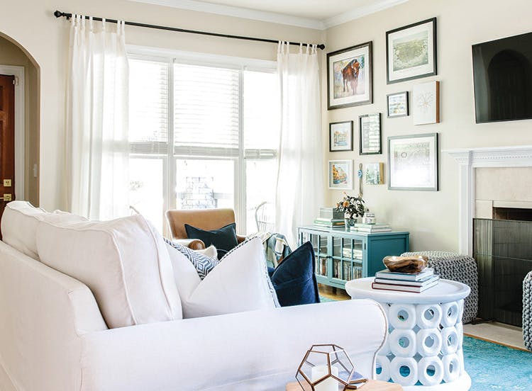
The homeowners had the foundation for a solid design, but it felt mismatched. Designers Berkeley Minkhorst and Kelley Lentini pulled together a cohesive look that injected personality and color throughout the living spaces.


OPPOSITE: A reworking of seating arrangements— including separating the pair of camel-colored leather chairs—made the living room feel dramatically larger. ABOVE: House of Nomad designers painted the dining room wall turquoise and added interest with an oversize, modern white mirror and local artwork from Slate Interiors.
To keep the dining room from feeling too heavy on wood, the designers swapped the end chairs for a pair of host and hostess chairs and added a fig leaf plant and planter; both design moves instantly breathed life into the dining room. The industrial, brass chandelier—an existing purchase by the couple—remained.
In the adjacent living room, it was all about the rug. Easily the biggest investment—and most dramatic addition—the wool rug is “beautiful and hand-woven teals, blues, and a bright, vibrant green that really pops,” says Lentini. “That, combined with the accent wall, and the living and dining rooms are speaking to one another. It felt intentional.”
A reworking of the seating arrangement resulted in a more approachable and comfortable gathering space for the couple and for entertaining. The two leather chairs were separated, and one was positioned slightly off to the side to create a small reading nook complete with side table for a cup of coffee or cocktail and a brass reading lamp. The addition of square ottomans flanking the fireplace provided additional seating and much-needed texture and interest. The finishing touch came from throw pillows, one of which was from the designers’ travels abroad, which they frequently do and has become their calling card.
Though there weren’t many new additions to the space when it came to furniture, it was the small tweaks and layering of texture and accessories that brought the space to life. “I used to change things out in the house every few months, always trying to figure out how to make it look the way I envisioned,” says Lacey. “After Kelley and Berkeley designed the space, I haven’t changed a thing.”