


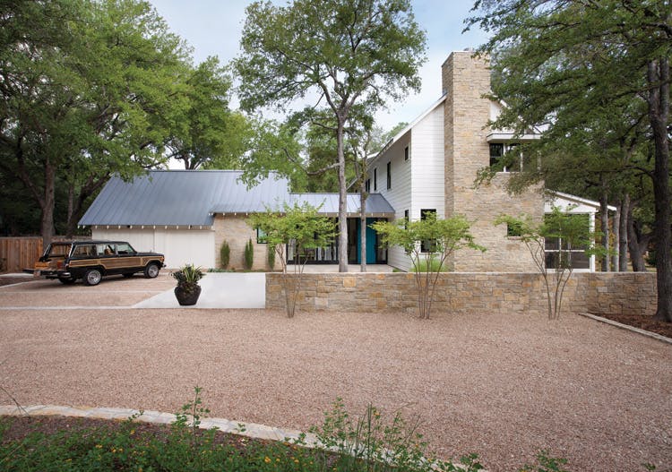
 Gravel crunches under your tires as you travel up the drive. Old oaks and elms cast long shadows on a tin roof. Texas limestone shapes a two-story-tall chimney. These are the sights and sounds that greet you on approach to this farmhouse that seems deep-rooted to the place but also new somehow. It’s the work of Tim Cuppett and his eponymous architecture and interior design firm located in Austin, Texas. “If you asked a kid to draw a house, it would have a big gable, windows, a door—very simple elements. That’s the direction we wanted for this house, to keep it fundamental,” explains Cuppett.
Built for a young couple with two small children, this Austin-area home is close to town but still feels rural. An old home was removed from the lot, and the new home was sited among mature trees, leaving an adjacent meadow of native grasses undisturbed. The homeowners made few requests of the architect. They wanted the kitchen to be central to the home and they defined the number of bedrooms and bathrooms they needed, but mostly left the aesthetics in Cuppett’s hands. “By looking at things they liked, I knew they had conventional tastes. We pushed them just a bit beyond their comfort zone to create a house that was a little more modern,” he says. “We always try to push clients a little further to create a more dramatic experience. In the end, they love it.”
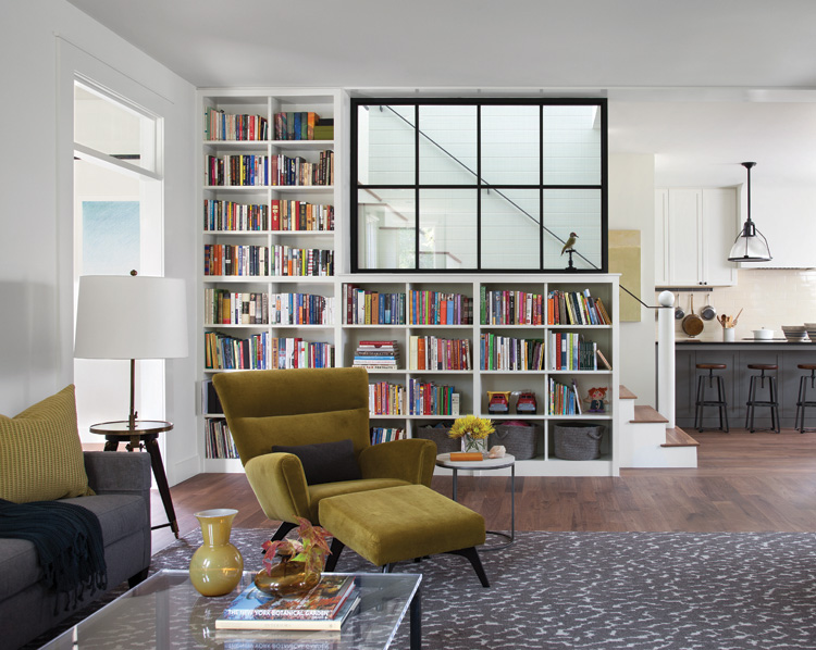
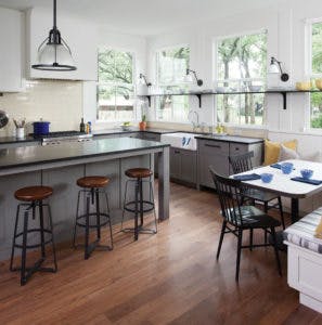
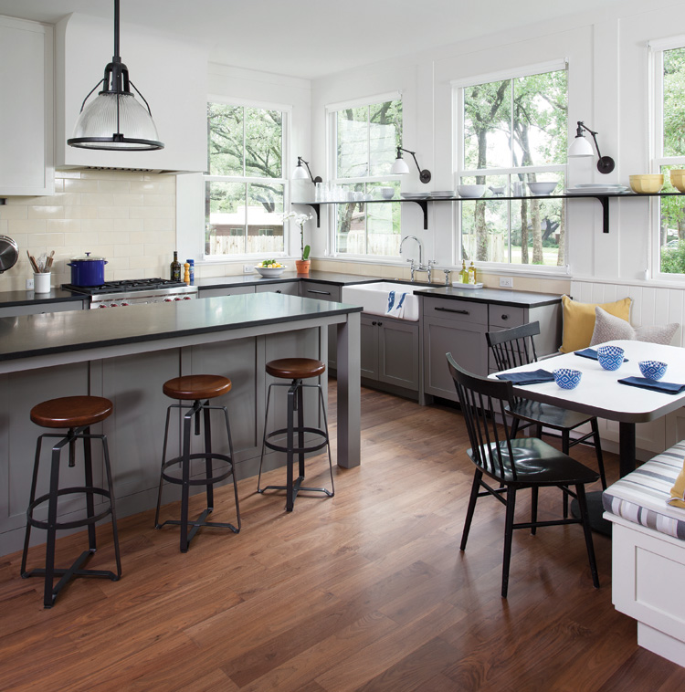
For these homeowners, part of that push was convincing them to allow an interior window at the stairwell. “Because the living room and kitchen come together with a stair in the middle, that could potentially make the living room dark,” says Cuppett. “By putting a large window in the stair landing, we were able to fill the middle of the house with daylight.” .
When pushing limits and conventions, how does an architect gain trust from a client? “When I meet a client, I say, ‘I’m g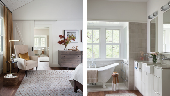 oing to show you things that you are not comfortable with. I’m going to tell you that I know what I’m doing and expect you to trust me,’” he says. Cuppett’s experience and portfolio are sufficient for that approach to work, yet he’s never a bully. “Of course, the clients make the final decisions. I’m never going to get mad and quit because the homeowners don’t go along with my plan. I tell my clients what I think, give them the facts as I see them, but they ultimately get to decide.” Choosing to follow their architect’s plan was a smart move for this couple as, in this design, capturing light is both aesthetic and practical. This layout means the homeowners rarely have to turn lights on during the day.
 Cuppett’s firm performed both architecture and interior design for these clients. “I’m thrilled when we get to do both,” he says. As part of the architectural services, Cuppett’s firm chose paint, tile, and countertops, while the design services extended to choosing plumbing and light fixtures, as well as furnishings, window coverings, and rugs. “We give clients as much help as they want. We try to help them do the whole thing,” he says.
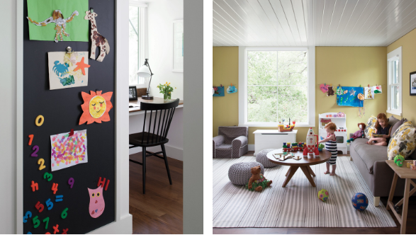
Inside and out, the home’s palette is mostly white and black with shades of gray. The parallel lines of the Hardie siding and tin roof continue indoors with glossy-white shiplap used to accent the stairwell, and ceilings in the dining room, master bedroom, and kids’ playroom. Judicious touches of color stand out against the neutrals. The exterior entry door is bright teal, while the interior uses gold and ochre on furniture pieces, drapes, accessories, and accent walls.
“It helps when the architecture and interior design work together,” says Cuppett. “I think it makes for a more successful project because in the end the house is really designed to support the way the family lives.”
 Making the Old New Again
Architect Tim Cuppett values the simplicity of older homes. “Old houses were stupid simple. Basic geometric forms, simple building skins, simple window patterns—uncomplicated. We really try to make all of our houses that way. I think it makes for a better house,” he says. He incorporates lessons learned from older homes into his design work.
Capture light from two sides. “The best rooms in old houses are corner rooms with daylight coming in on two sides. In homes we design, we try to get balanced light into every room,” says Cuppett.
Embrace squares and rectangles. Some new homes are overdesigned with too many angles and embellishments. Simple clean lines provide a more modern look.
Bigger isn’t always better. “Houses today are so much bigger than they used to be. There’s a trend of ten-foot ceilings on every floor. That makes a house gigantic. Old houses weren’t that way. They were more compact,” he explains.
Article by home by design magazine.
Click here to view the article.