


When design consultant and blogger Nicolette Mason, her wife Ali, and their pug Frankie made the move from Brooklyn to Los Angeles, they traded hot pink for blush, stripes for palms, and brick walls for beachy floors.
Mason had a vision for what their new home should look like: less like her and more like them. The newlyweds needed someone to help merge their styles seamlessly, fashionably, and with an homage to lighter, brighter Southern California—Old Hollywood meets contemporary.
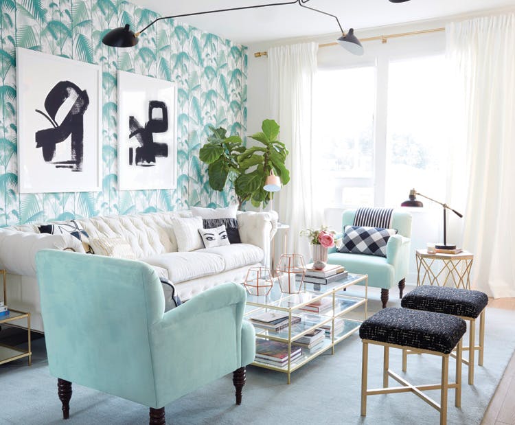
Enter Target and their home spokesperson Emily Henderson. The stylist, designer, and New York Times best-selling author heads Emily Henderson Design—an LA-based company that specializes in mixing eclectic styles on moderate budgets. “My job is to take what my clients think they want and do the best version of that possible,” says Henderson. So, she worked with Mason’s mood board, which included the iconic Martinique wallpaper from the Beverly Hills Hotel, to create an interpretation of Old Hollywood meets contemporary that fit the couple and their new condo.
Henderson and her team got to work on a weekend makeover of the open living room and dining room that would complement the design Mason was already working on in the rest of their home. There was next to nothing in the spaces from the start: blank white walls, a coffee table, a side table, a fiddle-leaf fig plant, and a button-tufted Cococo sofa. “The wallpaper was our big moment, and the jumping-off point for everything else in the room,” says Henderson, who opted for a soft palm pattern by Cole & Son. “It brought in the graphic element that allowed everything else to stay neutral and calm.”
Pink was another one of Mason’s must-haves. “Instead of adding in a ton of pink, we brought in the metallic du jour—rose golds and coppers,” says Henderson. “I think that with that wallpaper, had we added a lot of pink, it could have looked really silly and young. The addition of the pink metallic kept things quiet but still super feminine.” Metallics complement the palette of mint, blush, black, and white throughout the living space. Subtle accent patterns in pillows, throws, and artwork were introduced for contrast.
Many of Henderson’s designs feature a combination of splurges, saves, and a bit of history. “I believe a room is soulless without something that is vintage or antique,” says the designer. Because a fair amount of the decor was provided by Target, there wasn’t an overwhelming demand for secondhand pieces. Here, the soul of the space came in the form of the high-quality, oval, wood dining table by Baker Furniture. The thrifted table originally had a dark-cherry finish, which was updated with a low-sheen, white lacquer and finished with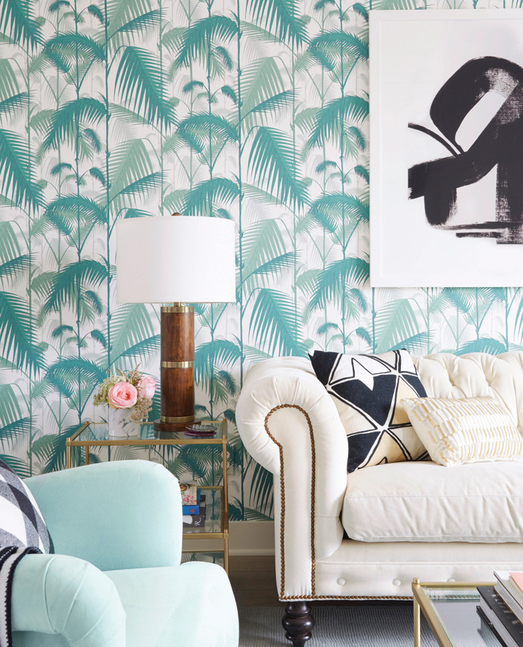 a set of new, black, Windsor-inspired chairs. “We kept the foundational pieces totally simple and clean, then layered on the glam with the chandelier and the tableware,” says Henderson. The brass-and-wood bar cart and Jonathan Adler Sputnik chandelier gave the dining room a heavy dose of Old Hollywood.
A variety of neutral colors and midcentury shapes were sure to keep the space looking modern, but Mason still longed for pink on a larger scale. So, they painted the gallery wall in the dining room a sweet shade of blush—Pirouette by Devine Color (a Target-exclusive by Valspar). It was neutral enough to let the artwork pop, but pink enough to make Mason feel right at home.
“It feels just so happy and it looks so pulled together,” says Henderson of the weekend install. “I think that if I had two goals for every single project it would be that—happy and ‘pulled together.’Not perfect. Not safe. But where the room, no matter what style, exudes a happy feeling and at the same time, looks and feels like someone cared enough to make it work.”