


Merewether, a suburb of Newcastle, New South Wales, Australia, is an area brimming with funky cafés, fashion stores, and creative artisans. It’s also home to some of the region’s most famous beaches, beautiful national parks, and dramatic cliff top walks according to Louise Walsh, an interior designer located in Lennox Head, NSW. “This 4,300-square-foot home was built in 2015 by a couple who bought the original land and existing house twenty years ago,” explains Walsh. “The original home was demolished in 2014 to make way for new construction designed by EJE Architecture [with offices in Sydney, Newcastle, and the Gold Coast] and my company, Louise Walsh Interior Design [with additional studios in Brisbane and Sydney, and current projects in Aspen and San Francisco]. Construction was completed by Newcastle’s Malman Constructions.”
“From the outset, it was clear that the clients were passionate about this project and had spent many years planning their dream home,” says Walsh. “For this reason, it was very important to us that the interior not only reflected their environment but was also a true reflection of their personality and lifestyle.” One partner particularly loved splashes of color and tribal patterns, while the other preferred calmer blues and greens. “We developed an interior palette that responded to each person, but also married their individual preferences together,” she adds.
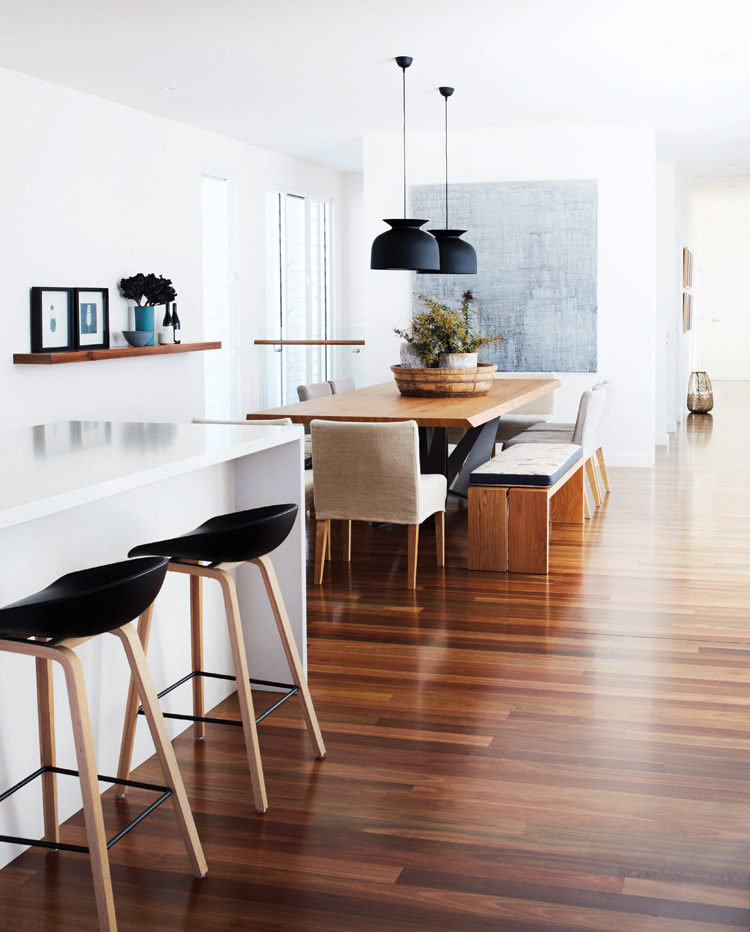
The kitchen is white with a backsplash of gray-hued glass mosaic tiles. “The Di Lorenzo tiles were the starting point for our overall color palette,” says Walsh, who custom designed the white cabinets. Countertops are Caesarstone quartz surface for durability. Lighting pendants, with a white ceramic frame and walnut base, tie together the wood and white tones.
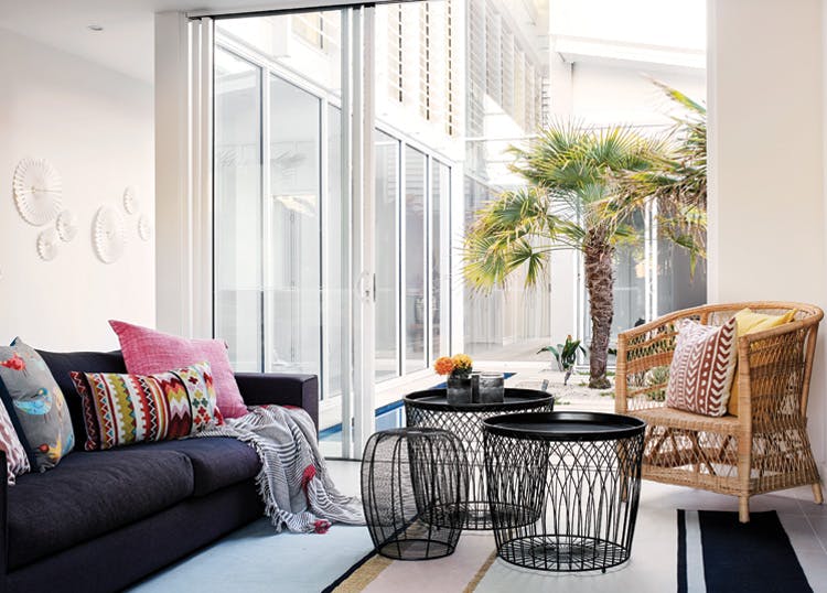
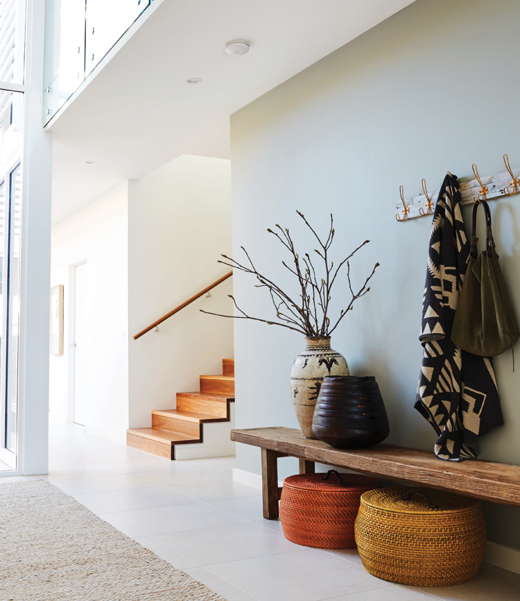
Continuing the neutrals into the living space are walls in Dulux Natural White paint and a stained hardwood floor made from native Australian blackbutt. Walsh says that she dappled color and texture in accent items such as cushions and decor while keeping the base palette of larger items, like sofas, in neutral tones. She then layered textural items throughout with occasional chairs, lighting, and decor. “We added touches of blues and greens to reflect a beachside environment,” explains Walsh. “This further complemented the many natural textures we used, such as hardwood timber, wicker, aged oak, metal, and weighty fabrics like Belgium linen, natural hemp, and cotton.” The textures and patterns play into the use of color, each becoming a tone in itself.
A coffee table offers practicality with a unique use of a conservative American oak top and modern, white tubular metal legs. The pale-white sofa is accented by colorful cushions that were custom designed by Louise Walsh Interior Design using Australian fabric patterns. The floor covering is a custom woven jute rug. “The rug is a key element that anchors the furniture and pulls the space together,” says Walsh.
Adjacent to the living space is an area that can function separately or join with the interior when the owners are entertaining a large group. Walsh kept the palette in this room complementary to the interior palette, maintaining a real connectivity between the areas. Walls of windows have shutters that can be closed to protect against rain and wind or provide privacy from neighbors. The floor is a neutral ceramic tile laid in a brick pattern. The lovely Manutti dining table, made in Belgium, has a steel base and a timber slatted tabletop. Dining chairs are rich, dark wicker. “Occasional seating allows the space to open to the internal living space so when entertaining, the two areas can become one,” says Walsh.
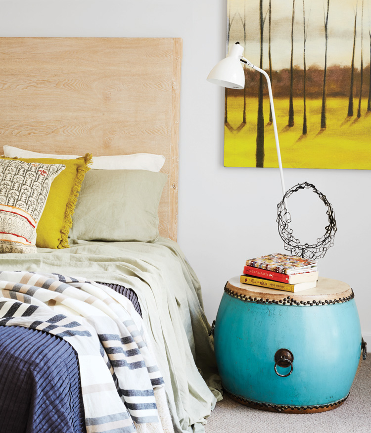
The four bedrooms in this home have individual interpretations. The master suite looks to the beach, so Walsh picked up muted grays and greens from the landscape to create an elegant aesthetic. Two of the guest bedrooms have brighter color play. One, overlooking an inner courtyard, has pops of yellow and sage green in tribal textures. Another guest room is in a secluded area of the house and, according to Walsh, it has become a sanctuary for guests. There, she used muted greens, blues, and tribal prints to enhance the serene ambience.
“The clients wanted an interior that reflected their natural environment. They wanted a house that was relaxed, interesting, and fun,” says Walsh. “Entertaining was important to them, as was practicality of finishes to ensure selections made were durable and timeless.” Walsh combined subtle and strong neutrals, accenting them with interesting textures and patterns, and an occasional dash of bright color. The result is a lovely space that relates to the beach landscape and succeeds as a livable, comfortable, yet refined home.